
MediNest
A mobile application that enables parents to securely store, organize, and access their children’s health records in one place.
In this eight-week UX design project, I worked independently as the lead UX researcher and product designer.
During the discovery and ideation phases, I conducted user research and surveys to identify families’ pain points in managing children’s medical documents.
Challenge: To design a simple, intuitive mobile app that allows users to store, search, and share their child’s medical records.
-
while receiving timely appointment reminders.
-
all from a single, easy-to-use platform.
66% of the parents said they would use MediNest frequently over whatsapp or other temporary apps.


Research goals
Recognizing the complexity of the prompt, i broke it down into manageable subproblems and defined clear research goals to address each one.
To understand common challenges parents/guardians face while maintaining their children’s health records and managing healthcare visits.
To understand how parents manage the process of retrieving and printing their child’s health records when required by schools or camps.
To understand the challenges they go through in remembering children’s healthcare visit dates.
How do you currently store and organize your child’s health records?
What challenges do you face in maintaining health records?
How do you keep track of your child’s upcoming health visits?
How do you typically retrieve and print your child’s health records when requested by schools or camps?
Research Methodology
I conducted user research with a remote survey. The survey helped highlight real concerns and gave direction for the next steps. Even though the sample was small, it provided early signals about what mattered to parents.
Insights: I found out that participants were still using traditional methods of healthcare record management and appointment tracking.
Key Findings and User Pain Points
Maintaining only physical copies of records leads to misplacement or loss.
Parents sometimes forget upcoming healthcare visits and appointments.
Parents have to reach out to health organizations every time a copy of records is required.
Sharing records with schools has to be done manually (physical or digital).

User Personas
Based on the user pain points, I created two provisional personas to capture and communicate user insights throughout the design process.

The Ideation stage focused on generating a wide range of ideas.
I employed popular methods such as Crazy 8 sketches for each problem statement and 'How Might We' questions to explore and develop diverse initial concepts.
Final Decision Rationale
The final decision was made based on a structured evaluation of three critical criteria:
User Pain Points: Focused on solving the key challenges identified through research.
Usability: Designed to be intuitive and easy to navigate for a seamless experience.
Accessibility: Ensured inclusivity by accommodating diverse abilities and meeting accessibility standards.
By prioritizing these criteria, the design delivers a user-centered, functional, and inclusive solution.


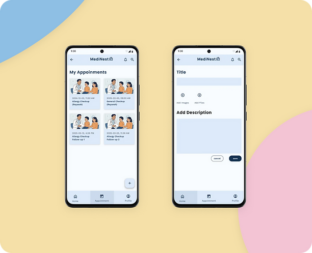
Screen 01
Home Page
01
Search Bar
Quick lookup for medication names with live filter
List Items
Thumbnail + name + dosage + overflow menu
FAB Button
Persistent add action, anchored bottom-right
Bottom Nav
3 tabs: Home · Appointment · Profile
Key Numbers
Design Metrics
4
CORE SCREENS
2
USER FLOWS
02
3
NAV TABS
1
FAB ACTIONS

Style Guide
I created a comprehensive style guide for the app consisting color palette, Typography, components and it's variants
Icon Set

Color Palette

Buttons and Bottom Nav. Bar


Typography
Aa
Semi bold
HEADINGS/SUB-HEADINGS
Poppins
ABCDEFGHIJKLMNOPQRSTUVWXYZ
Aa
Regular
BODY
WORK SANS
ABCDEFGHIJKLMNOPQRSTUVWXYZ
Semi bold
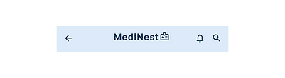
Top Nav. Bar
Drop Down Menu

FAB


Final Screens
Production-Ready UI

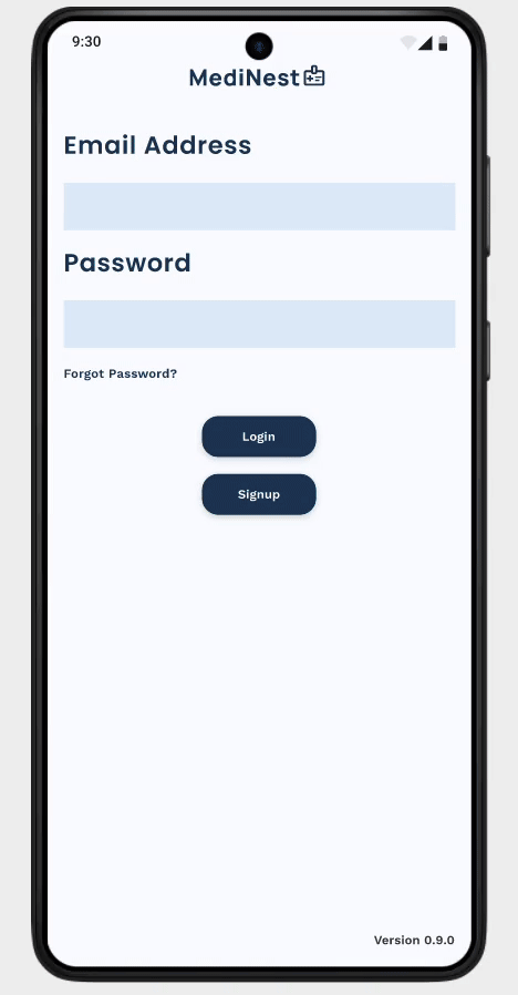
Hi-Fi Prototype
Based on the usability study insights, I optimized the design by repositioning the CTA, sharpening the visual hierarchy, and simplifying labels to resolve user pain points. These improvements were finalized in high-fidelity mockups, with a WCAG AAA-compliant color palette to ensure accessibility for all users.
System Usability Study (SUS)
The results strongly validated the design.
All participants successfully completed core tasks like record creation and appointment tracking.
clear adoption potential.
2 out of 3 parents strongly agreed they would use MediNest frequently
83.3% felt confident managing health records independently.
99% agreed the main user flow was clear and easy to follow.
proving accessibility and ease of use.
83.4% of parents said they wouldn’t need any technical support
Next Steps: To strengthen validation, I would expand testing with a larger, more diverse group of parents, refine onboarding for faster adoption, and introduce automated vaccination reminders to support long-term engagement.