
Windows OS Redesign
Reimagining Windows for The Next Billion Users.
Project Timeline: 2 Weeks
Tools Used: ChatGPT, Perplexity, Google Stitch, and Figma.
A 4-stage sprint blending AI-powered tools with human judgment from research using Perplexity, to ideation with Stitch, to visual refinement in Figma, guided by ChatGPT for project management and clarity.
Windows’ Start Menu & Taskbar have been core navigation tools since 1995, evolving over decades but accumulating clutter.
Problem Statement: Over three decades, Windows’ navigation evolved from a desktop productivity tool to a complex ecosystem. Today, its Start Menu and Taskbar feel heavy, inconsistent, and out of sync with mobile-native expectations.
Mobile style tabs, cards, widgets and flat navigation.
Always accessible Recycle bin like quick settings or notification Panel.
Competitor Analysis
Major learnings centered on mobile-first design, familiar metaphors, and task/navigation patterns validated by leading platforms like ChromeOS, Android, iPadOS, and macOS.
Visual & Interaction Paradigms
8px grid, 40×40px touch targets
open icon systems for accessibility
Modern typography, scalable icons
glassmorphism, and card layouts
Key Lessons from Competitors
Competitors favor search-first navigation
Icon-based launchers
Quick-access settings for mobile-first usability
Minimal menus reduce friction
Takeaway: A lightweight, intuitive redesign can combine Windows’ power + footprint with simplicity, making it indispensable.
"Too many layers, too many clicks, everything’s hidden behind menus."
The User Consensus
Recognizing the complexity of the prompt, i broke it down into manageable subproblems and defined clear research goals to address each one.
"Why can’t Windows just stay powerful but feel as natural as a mobile OS?"
"Every update changes how I find things. I just want one simple, familiar layout that doesn’t move every year."
Source Note: Synthesized from public discussions, product reviews, and user forums, 2012–2024.

Desktop Continuity
This redesign retains the desktop as the primary environment, keeping it clean yet powerful.
Familiar Anchors
Kept the Start button, Taskbar, and recognizable icons, ensuring legacy users don't feel lost.
Consciously Avoided Pitfalls
This redesign consciously avoided these pitfalls by adhering to four key conditions.
Hybrid Model
Mobile’s simplicity (tabs, widgets, flat navigation) while preserving desktop power (drives, devices, system controls).
Decluttering
Removed “My Computer”, simplified the Start Menu, and made the Recycle Bin a permanent sliding window, ensuring clarity and trust.
(Disclaimer: All design decisions, ideas, and reasoning in this section were made entirely by me. No AI tools were used at any stage.)
Design Rationales
Here are the design rationales behind all the core screens
Home Screen & StartMenu
-
For legacy users: familiar Start button, Taskbar, and icons — no relearning.
-
For next billion users: mobile-style tabs, card widgets, and flat navigation
Recycle Bin Redesign
-
The new Bin is a permanent sliding system window, always accessible like Quick Settings or Notifications.
Automatic Deletion in Recycle Bin
-
Inspired by cloud storage automatic deletion keeps it clean and self-managing.
-
It reduces cognitive load, prevents system slowdowns, and aligns with mobile expectations
Replacing Right-Click with a 3-Dot Menu
-
Right-click was hidden, inconsistent, and unfamiliar to mobile-first users.
-
Core actions stay upfront; advanced ones live under following progressive disclosure.
Lo-Fi Sketches
%20(1).png)
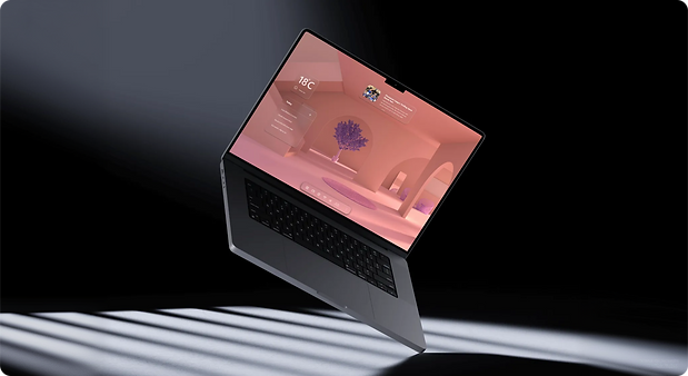
Hi-Fi Screens
Each interface focuses on clarity, balance, and a mobile-first feel, translating the vision of a “future-ready Windows” into clean visuals, refined spacing, and consistent interaction patterns.

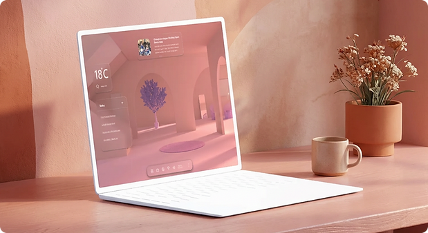
Desktop Screen
Familiar anchors, widgets and cleaner layout. The desktop stays central—powerful yet decluttered for legacy users.
Start Menu
Tabs, and flat navigation. Bridges mobile-first simplicity with classic Windows familiarity.

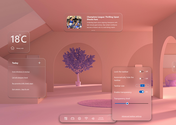
Taskbar
Visible controls, no hidden gestures. Three-dot menus replace right-click, aligning with mobile habits.
Drive and Devices
The old ‘This PC’ window is reimagined as a clean, visual hub with clear storage indicators and easy access actions.
Drives now live directly on the Taskbar—removing redundancy and making system navigation effortless and modern
.png)
.png)
Drive and Devices (Screen 2)
All connected devices—Bluetooth, displays, and USBs—are managed in one consistent, tabbed interface.
Users can view, eject, or disconnect with a single click, mirroring the simplicity of mobile device settings.
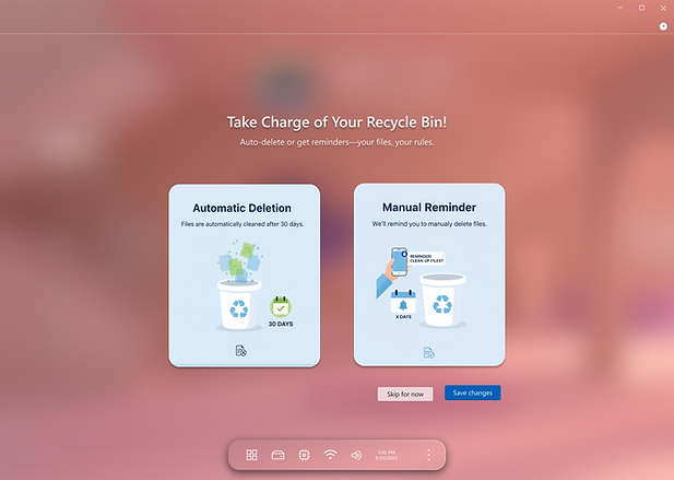
Recycle Bin (Onboarding)
Recycling becomes intuitive from the first step—users choose automatic deletion or reminders based on comfort and control. This onboarding turns maintenance into empowerment, aligning with modern systems that teach through simplicity, not clutter.
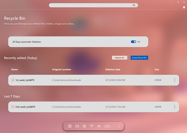
Recycle Bin (Main screen)
The Bin evolves from a fragile icon into a living system window—clean, always accessible, and self-maintaining.
With auto-clean toggles and categorized history, users gain clarity, confidence, and full ownership over their digital space.
Keytakeaways
Final reflections on the design journey and the measurable value delivered.
The redesign focuses on clarity, scalability, and a unified, touch-friendly experience.
Each element — Start, Search, Taskbar, Quick Settings — was reimagined for minimal cognitive load and modern visual balance.
The final design bridges Windows’ familiar identity with a modern, mobile-native experience for the next generation of users.